Polynomials and Polynomial Graphs in Real Life
Watch or Read?
If you’d like to explore real-life polynomials through a short video, check out the preview on the right (or below if you’re on mobile).
Prefer text? Just keep reading!
Where Are Polynomials and Polynomial Graphs Used?
Polynomials and polynomial graphs find widespread application across diverse fields such as science, agriculture, engineering, and marketing, especially for analyzing substantial datasets. In fact, anyone working with computers and utilizing spreadsheet programs like Microsoft Excel, Google Sheets, Apple Numbers, or LibreOffice Calc could benefit from understanding polynomial graphs.
Which Jobs Utilize Polynomials and Polynomial Graphs?
Many computer-related professions involve data analysis, making polynomials and polynomial graphs invaluable tools. Financial analysts use polynomial graphs to understand market trends and make investment decisions, while scientists use them to identify patterns in data. Marketers rely on polynomial graphs to grasp shifts in consumer behavior, while engineers utilize them to analyze complex technical systems and predict outcomes. Epidemiologists depend on polynomial graphs to model disease spread and develop effective public health strategies.
If you envision yourself working in an office in the future, you too might find polynomial graphs essential in your work. The following sections will present a case study to illustrate this further.
Case Study - Analyzing Webpage Visibility with Polynomials
Introduction
Webpage visibility on the Internet indicates how easily individuals can find and access a webpage via search engines like Google, Yahoo!, or Bing. Understanding webpage visibility is crucial for businesses and website owners as it directly influences their online presence, brand recognition, and ultimately, their ability to reach their target audience.
Polynomials and polynomial graphs are crucial for understanding this visibility. The following paragraph will outline the necessary data required to graph relevant polynomials.
Understanding Data Required for Graphing Polynomials
Below is a table displaying real data regarding the average position of a webpage in Google search results. For example, on April 22nd, the webpage was approximately 30th on average. The day before, it was around 26th place. On April 20th, it was about 43rd, and the previous day, it was nearly at the top of the search results.
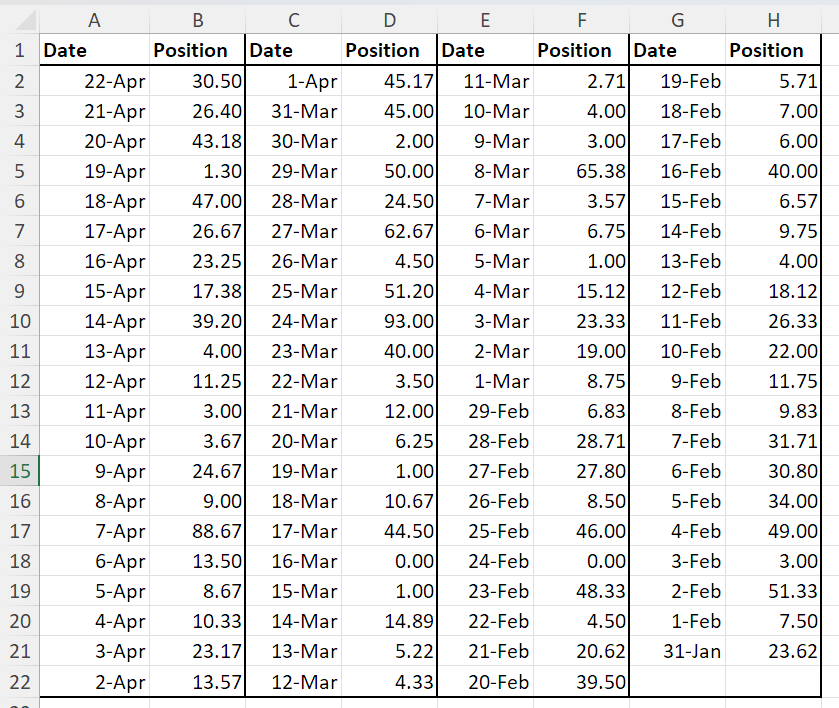
Our challenge is to understand the trend of this position. Understanding the trend involves determining whether the webpage’s position in Google search results is:
- improving and moving up,
- worsening and decreasing,
- remaining stable.
Let’s plot this data on a Cartesian coordinate system, with days on the x-axis and the position in the search results on the y-axis.
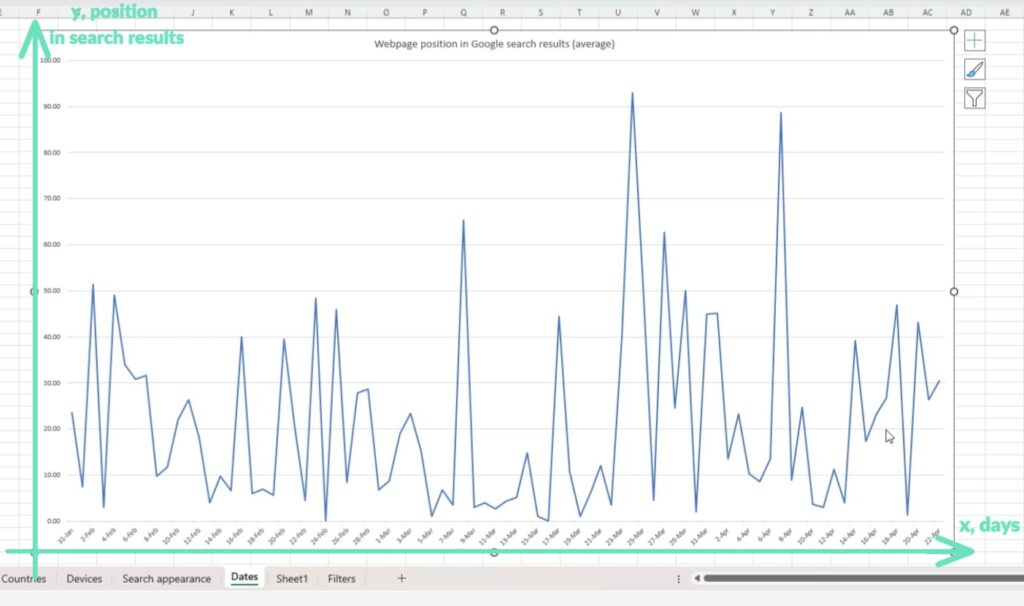
We can observe a “jumping” graph, where the trend is not obvious, and it’s challenging to tell if there’s any trend at all. However, plotting polynomial graphs based on this data can provide some insights. Many spreadsheet computer programs (here we use Excel) allow adding a trendline on top of data in the form of polynomial graphs. In the following sections, we will describe this for 1st, 2nd, and 3rd degree polynomials.
Graphing 1st, 2nd, and 3rd Degree Polynomials
In this example, we will create graphs for three types of polynomials: 1st, 2nd, and 3rd degree polynomials. The simplest polynomial graph is the graph of a 1st degree polynomial, also known as a linear function. The graph of a 2nd degree polynomial, commonly referred to as a parabola, represents the graph of a quadratic function. The graph of a third-degree polynomial is called a cubic curve, representing the graph of a cubic function.
Graphing 1st Degree Polynomial
Let’s incorporate the graph of the 1st degree polynomial onto our data.
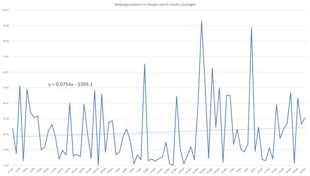
This polynomial graph can be described by a linear function in the form:
\( y = 0.0754x – 3399.1 \).
As observed, the average website position is increasing, indicating a decline in the website’s average position in search results. This suggests that the webpage’s average position is worsening. However, it may be worthwhile to further investigate with the assistance of a second degree polynomial.
Graphing 2nd Degree Polynomial
Let’s overlay the graph of the 2nd degree polynomial onto our data.
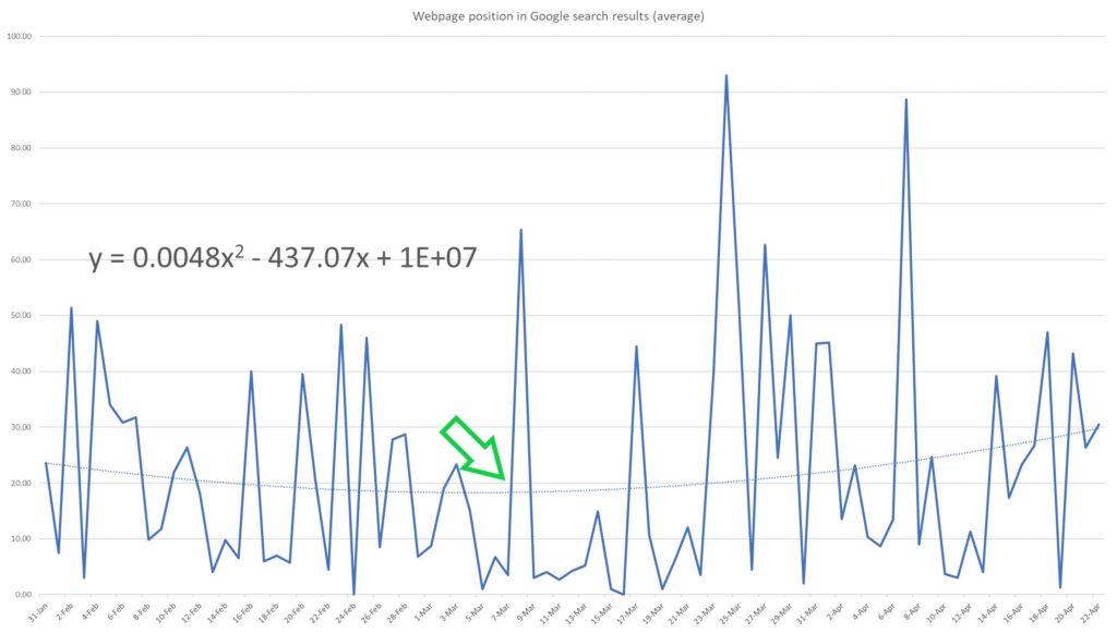
This polynomial graph can be described by a quadratic function in the form:
\( y = 0.0048x^2 – 437.07x + 1 \times 10^7 \)
As you can see, it yields slightly different results. It suggests that the website’s position was improving until around the beginning of March (where the parabola vertex is, marked with green arrow), after which the position began to worsen.
However, once again, we need to inquire: is this truly reflective of reality? Let’s delve even deeper and employ the graph of a third-degree polynomial.
Graphing 3rd Degree Polynomial
Let’s incorporate the graph of the 3rd degree polynomial onto our data.
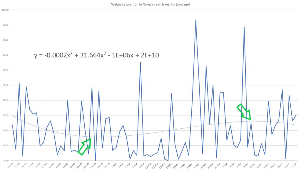
This polynomial graph can be described by a cubic function in the form:
\( y = -0.0002x^3 + 31.664x^2 – 1 \times 10^6x + 2 \times 10^{10} \)
As you can see, it once again yields different results. Specifically, the position of the website in search results seems to fluctuate, displaying both upward and downward movements.
It’s evident that the website’s position was improving until the end of February (observed at the minimum point of the polynomial curve). Then, the position worsened until around the beginning of April (noted at the maximum point of the polynomial curve), before improving once more.
Insights from Polynomial Graphs
While we’ve examined three different polynomial graphs, the question “What’s the actual trend?” remains unanswered. Is the website’s position in Google search results improving, worsening, or fluctuating? Which polynomial graph should we use to understand this trend: the 1st, 2nd, or 3rd degree polynomial?
In reality, there isn’t a one-size-fits-all solution. In this case, the parabola (representing the 2nd degree polynomial) and the cubic curve (representing the 3rd degree polynomial) are likely most useful:
- The parabola suggests that the change in website position occurred around the start of March (i.e., the website’s position started to worsen).
- The cubic curve indicates that some changes may have occurred at the end of February and the beginning of April.
Therefore, graphs of various polynomials are valuable, as their maximum and minimum points may indicate when changes occurred. These changes can involve shifts in search engine algorithms, updates to website content, or alterations in user behavior.
Conclusion
This example has showcased the practical, real-world application of polynomials and polynomial graphs. It illustrates how polynomial graphs prove useful in understanding the overall trend of data. Additionally, polynomial graphs enable us to recognize changes in trends through minimum and maximum points.
This example highlights the analytical strength of mathematics, empowering us to identify patterns within seemingly random data. It assists us in understanding trends and changes, refining strategies, and making decisions grounded in solid evidence.
Further Reading
Explore our other articles that delve into the practical applications of polynomials and their graphs in real life.
The article “Polynomials: A Real-Life Example (from Marketing)” demonstrates how simple polynomial equations aid marketers in understanding customer preferences.
Additionally, two articles, “Piecewise Linear Function: A Real-Life Example (from Public Health)” and “Parabola Equation: A Real-Life Example (from Public Health),” illustrate how graphing linear functions (1st degree polynomials) and quadratic functions (2nd degree polynomials) assist in predicting the need for psychology specialists in the public health system.
