Coordinate Plane: A Real-Life Example (from Medicine)

The coordinate plane taught in school is a useful tool for various applications where people need to show how one thing depends on another. For example, how the duration of our life depends on whether our lifestyle is healthy or not. This article explores it in detail.

Coordinate Plane: Example from Medicine

How to Make the Best Decisions?

Doctors and nurses must be able to make the best decisions to cure patients effectively. But how do they make the best decisions?

To make the best decision, one needs as much information as possible. However, information alone is not enough—it also needs to be clearly organized. And the Cartesian coordinate plane is an excellent tool for organizing information.

Coordinate Plane for Organizing Information

You probably know that smoking is not good for our health. If a person has a disease, then smoking can make it even worse. This is especially true for lung cancer – smoking is the leading cause of lung cancer, responsible for approximately 85% of all cases, according to the World Health Organization. Furthermore, among people diagnosed with lung cancer, smokers have worse chances of survival.

Take a look at the coordinate plane below.

Coordinate plane with white curve that demonstrates nonsmokers lung cancer mortality rate

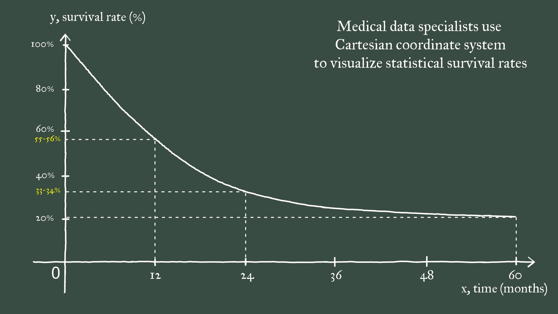
The X-axis represents time (independent variable), and the Y-axis represents survival percentages (dependent variable). The white curve represents the survival rate of patients diagnosed with lung cancer over five years. This is a very usual way that the coordinate plane is used in medicine, and actually in many other domains as well, to organize and present information.

Example of How to Use Coordinate Plane

As you can see, around 55-56% of patients endure after one year (x=12 months), dropping to roughly 33-34% in two years (x=24 months). In five years (x=60 months), only a little over 20% of patients survive.

What might not come as a surprise is that non-smokers show a higher survival rate compared to their smoking counterparts:

Coordinate plane with white and red curves, that correspond to nonsmokers and smokers lung cancer mortality rate.

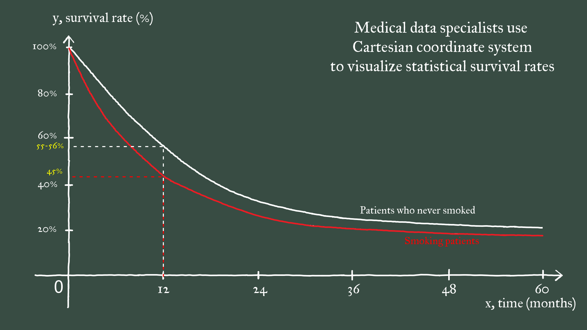
The red curve on the coordinate plane shows the survival rate of lung cancer patients who smoke. It reveals that after one year (x=12 months), around ca. 45% of smoking patients survive. Having both white and red curves on the coordinate plane is very convenient for comparison – you can easily see that the survival rate among smokers is approximately 10% higher than among non-smokers.

Conclusions

The coordinate plane is a truly universal tool that helps people organize data in a very clear and easily understandable way. Individuals who specialize in organizing and analyzing data are called data scientists, and today, data scientists are in very high demand. This example showed you a glimpse of the work of medical data scientists, but they work in various industries such as marketing, finance, weather and climate, and more.

Check the Facts!

Video version

It is convenient to follow the explanation in an animated way, and this is what our video version proposes. It contains more information, explains more about the usage of the coordinate plane in different workplaces, and also shows the importance of other school subjects for these workplaces. You can preview the video below or subscribe to the full video.

Want to receive a notification when we publish new article?
Like this article?
Read more from our blog:

What Real-Life Math Topic Interests You?

Interested in seeing how a specific math topic is applied in the real world?

Let us know your preferred topic, and we’ll create a blog post and video showcasing its practical applications.

If you’d like, you can also let us know which real-world domain you’d like us to explore!